Elegant minimalism A conversation with designer Philipp Aduatz The industrial designer Philipp Aduatz creates limited functional objects that are inherently sculptural and works with innovative materials and manufacturing technologies. He tells how an attempt to define a piece of bathroom furniture as an art object resulted in a long-lasting collaboration and why KLOMFAR bathroom accessories are one thing above all: minimalist and elegant.
.
A very good one and an increasingly intense one! In my apartment in Vienna I have a rather small bathroom, but very nicely decorated, with the prototype of a series I designed for KLOMFAR. In my house in Upper Austria, I enjoy a very spacious bathroom with natural stone. Through my collaboration with Martin Klomfar, my awareness of the beauty of the bathroom has increased even more. Because a bathroom is, of course, much more than a place where you go for your daily body care. It is a space for experiences, where you can express your personality in a very poetic way.
.
The size has changed a lot. Even though you can, of course, create a great bathroom even in a small space, you can see from the room layouts that people want to fully develop in a bathroom. To do that, they want space. After all, the bathroom has long ceased to be just a functional room, but a living space where people spend a lot of time. In recent decades, a major change took place and the bathroom became a world of its own. Something that is very well seen at KLOMFAR.
.
I definitely spend a lot more in it since becoming a father. I put a corner bathtub from EOS for Duravit in my house in Upper Austria. That’s nice. I can bathe there with my son and my wife. Spending time together in the bathroom is, not only for me, luxury.
.
For me it is the simple and reduced forms and an elegant minimalism. Also defining are the materials, from tiles or natural stone to fixtures and bathroom accessories. The lighting, which often emanates centrally from an LED mirror, contributes significantly to the atmosphere in the bathroom. The harmony of the selected accessories and a unified style make the bathroom as important a place to stay as a living room. To achieve a perfect result, it is important to get good advice.
.
.
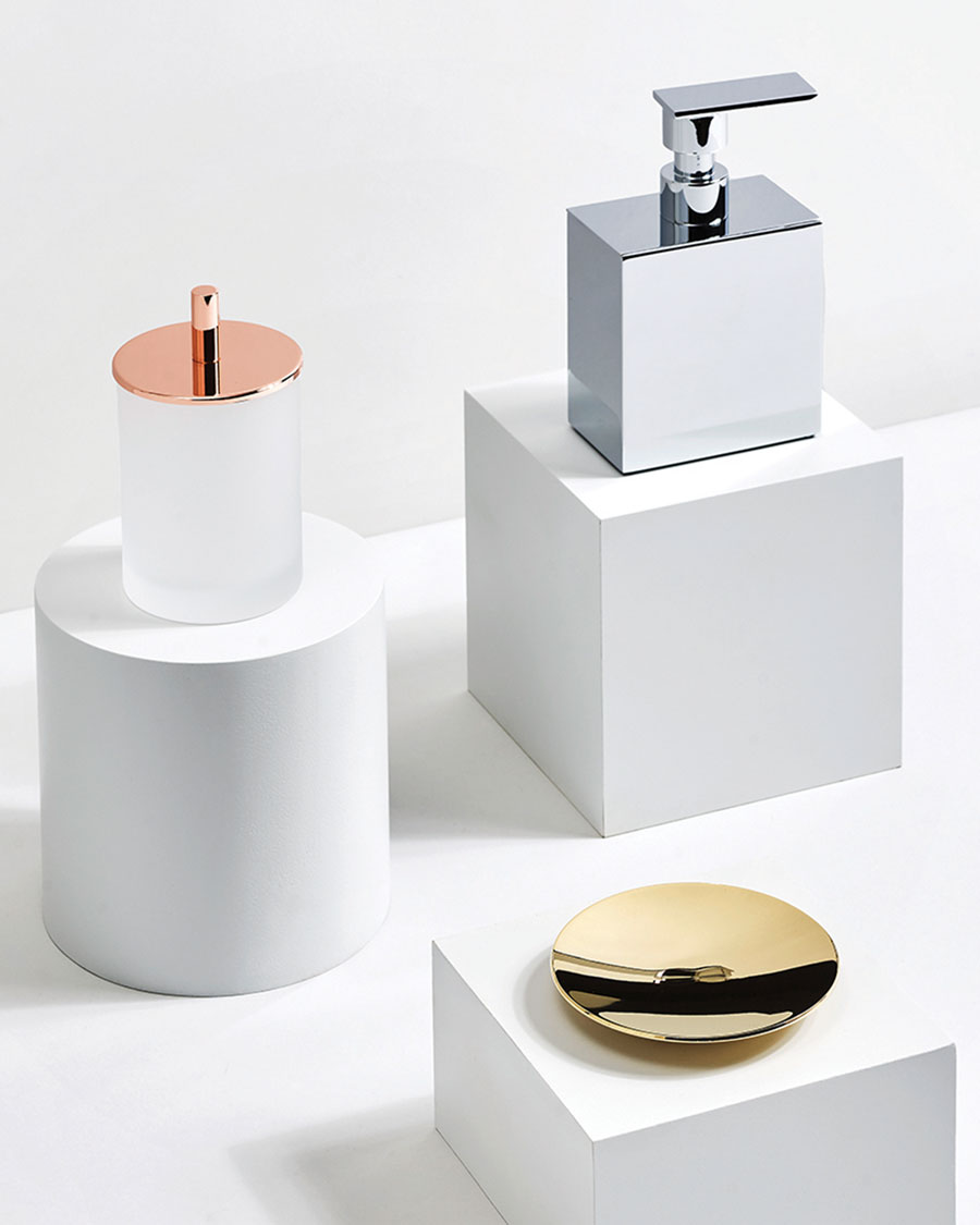
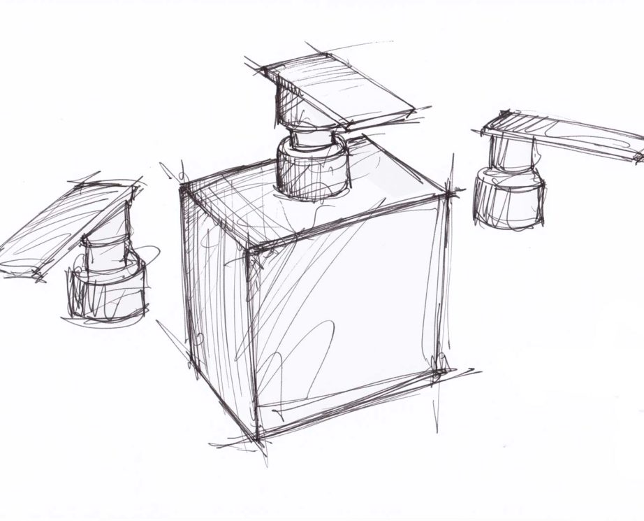
The Big dispenser is definitely one of my favorite items. I have one in chrome and a powder coated one in white. However, I would also like it in copper, preferably if it already has patina. I used to want everything perfectly shiny, but more and more now I’m drawn to the less perfect, because that has its own unique appeal.
Essentially, because the material plays a decisive role in determining the character of an object. Whether the surface is rough or shiny, polished or matte, tells something about the object. Whether it is elegant, rather raw or almost archaic. The soap dispenser, the soap dish or the handkerchief box, after all, you touch with your hands, feel them and see them up close.
My design for KLOMFAR is reduced, minimalist and elegant. It is about very simple, simple forms, which are implemented in the highest perfection in a manufactory in Barcelona. You could say that here any ornament is taken away to get a harmonious object. It is about the reduction to the essentials.
?
Because it is practical that he carries a lot of soap, but of course also because he should be an attention-grabbing signature piece in the bathroom. Here just the size works.
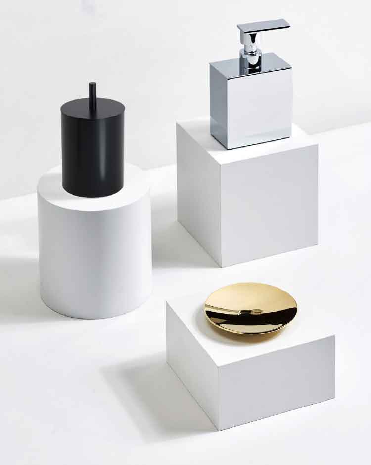
When I was studying, my role models were Richard Serra, Constantin Brâncuși, Tony Cragg and Henry Moore. They were all sculptors and had more influence on me than product designers. But there are also designers who apply the principles of sculpture to product design, like Ron Arad. That was my inspiration. In the series for KLOMFAR, I was able to apply everything I learned in the sculptural work, which is the understanding of form and proportion that is desperately needed in very simple forms like cubes or cylinders. By the way, I went to nude drawing every semester at the Angewandte in Vienna. I wasn’t particularly good at it, nor did I really like it, but I learned proportions there.
.
Exactly, it all started with the almost artistic objects of the “Aquawave” series. For this work, I was inspired by the structure of waves and the result was sculptural bathroom furniture, made to order. They are very complex to make, but in the bathroom they are a wonderful contrast to the prevailing minimalism.
Yes, indeed. But also the development of materials – and I would say that is at the forefront of my work with KLOMFAR. Martin Klomfar and I care a lot about materials and we talk about it all the time. KLOMFAR offers very many finishes, and that makes it very interesting for the customers, because it’s almost impossible not to find each other.
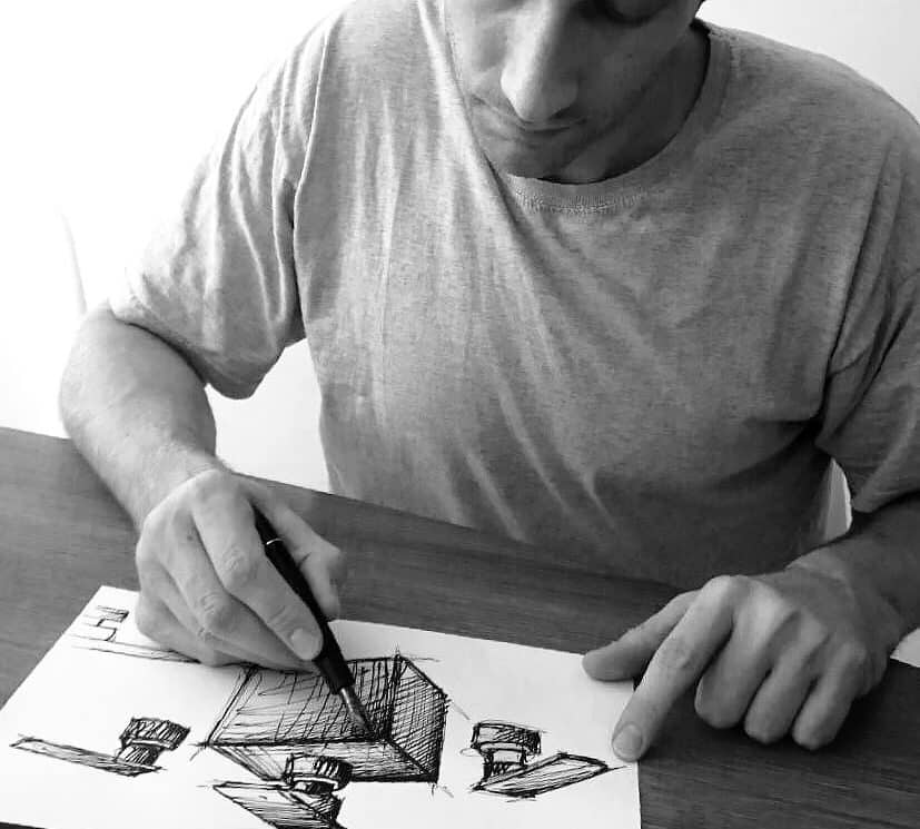
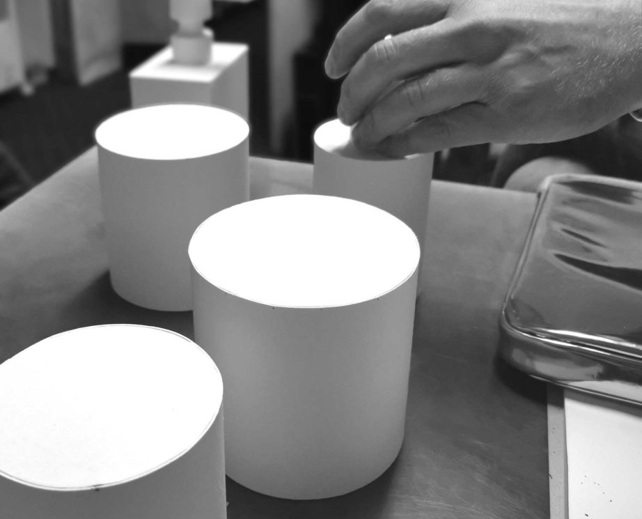
Martin is very good at formulating what he envisions. Model building is very important in our collaboration. For this I have made Martin a kind of construction kit, with many different pump attachments made of painted wood. He can then “play” with them. It’s fun to work this way because we have something to touch and can represent proportions well.
I come from an artistic family, so it was always too little for me to make “only” product design. But the art alone is also not enough for me, because there I lack the topics of technology and material. Depending on the angle from which you look at an object, it is either art or design, and it is this simultaneity that gives the object yet another dimension.
Nina Prehofer for Klomfar.